
Link Copied
 0
0
Keep your streak alive!
Tap an image in each project to review Simon's work.
0
Tap an image in each project to review Simon's work.

Designer
Creating since 2020
An AI-powered prompt analyzer, grader, and editor that uses best practices to ask personalized follow-up questions to make the perfect prompt.
A reimagined, AI-native search interface that proactively refines user intent and synthesizes trustworthy, cited answers in real-time.
A Gemini AI-powered web app that analyzes and grades memes on humor, originality, and replay value using interactive visualizations and Material 3 design.
| Client: | TransPerfect |
| My Role: | UX, UI, copywriting, testing |
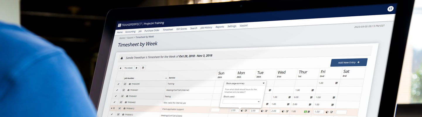
| Product Name: | ProjectA: Timesheet Console |
| Product Type: | Intranet web application |
| Project Type: | Full rebuild with updated framework and front-end redesign |
| Tools used: | Axure RP, Chrome Inspector (CSS/HTML), Photoshop, GIT |
TransPerfect is the world’s largest language services provider. They provide language and technology solutions for a global list of companies and complete over 400,000 projects per year. TransPerfect specializes in translation, localization, and interpretation.
I was the sole designer for the “Project A” team — responsible for UX research, UI design, copywriting, and testing. The team handled the development and maintenance of an internal accounting application which was used by the entire company. Users ranged from sales staff to all production/finance/accounting departments.
This was a complete redesign with code rewrite to the existing application to incorporate new functionality (primarily the ability to track/associate pre-purchased time blocks) and new front-end framework (Angular). This application was designed exclusively for desktop browser access only and therefore responsive design was not a requirement for this project.
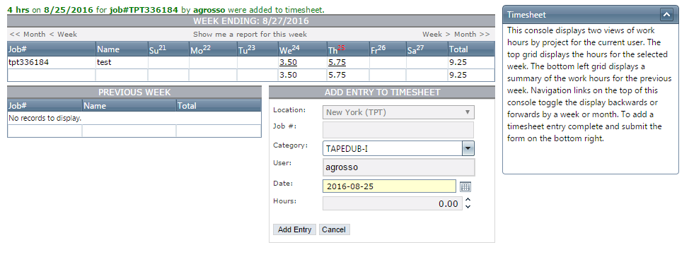
Original TP Timesheet Portal (Pre-Redesign)
To identify best practices and potential areas for innovation I analyzed and audited popular time-tracking web applications for:
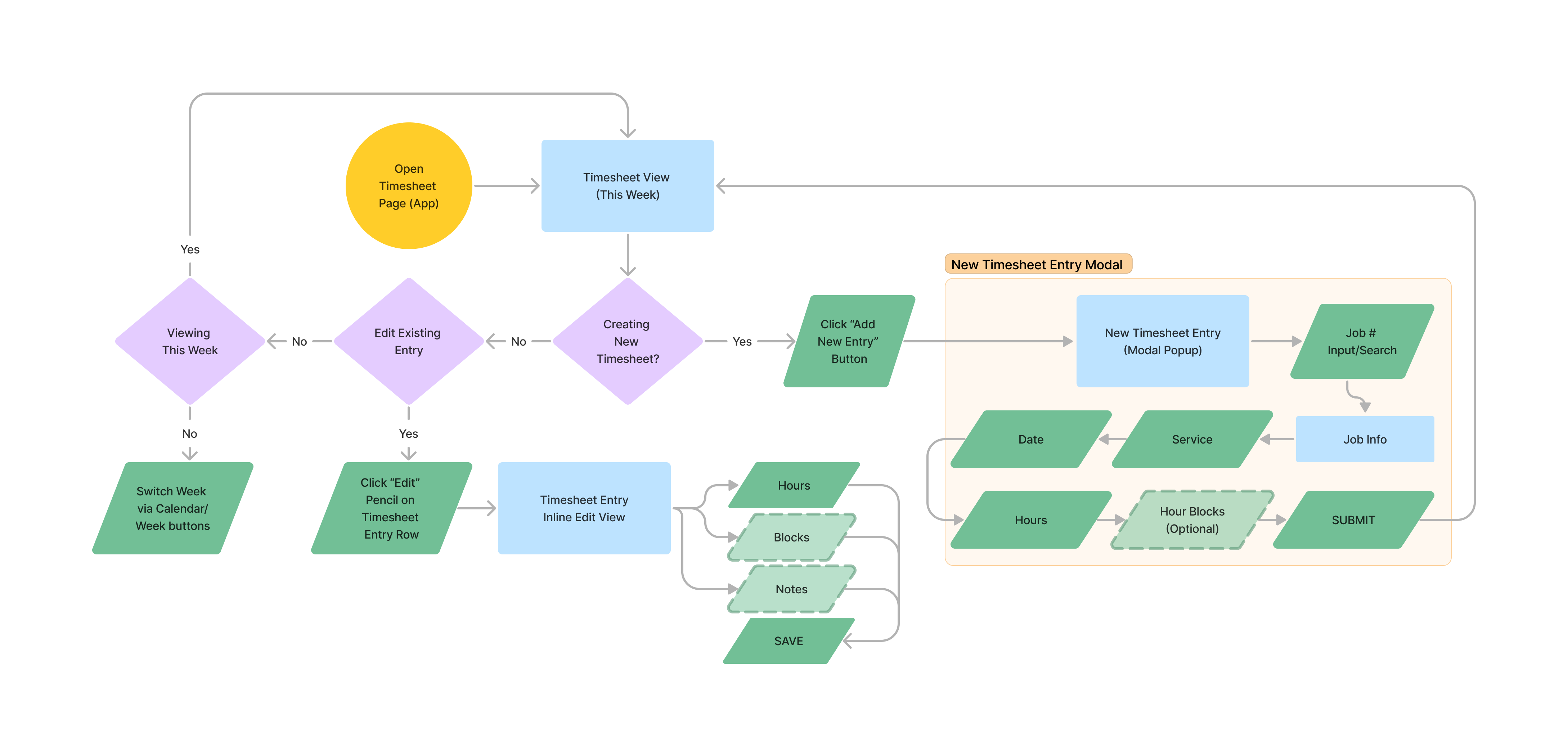
Timesheet Console User Flow
Low-fidelity Wireframe made using Axure RP

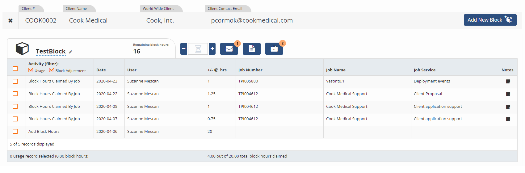
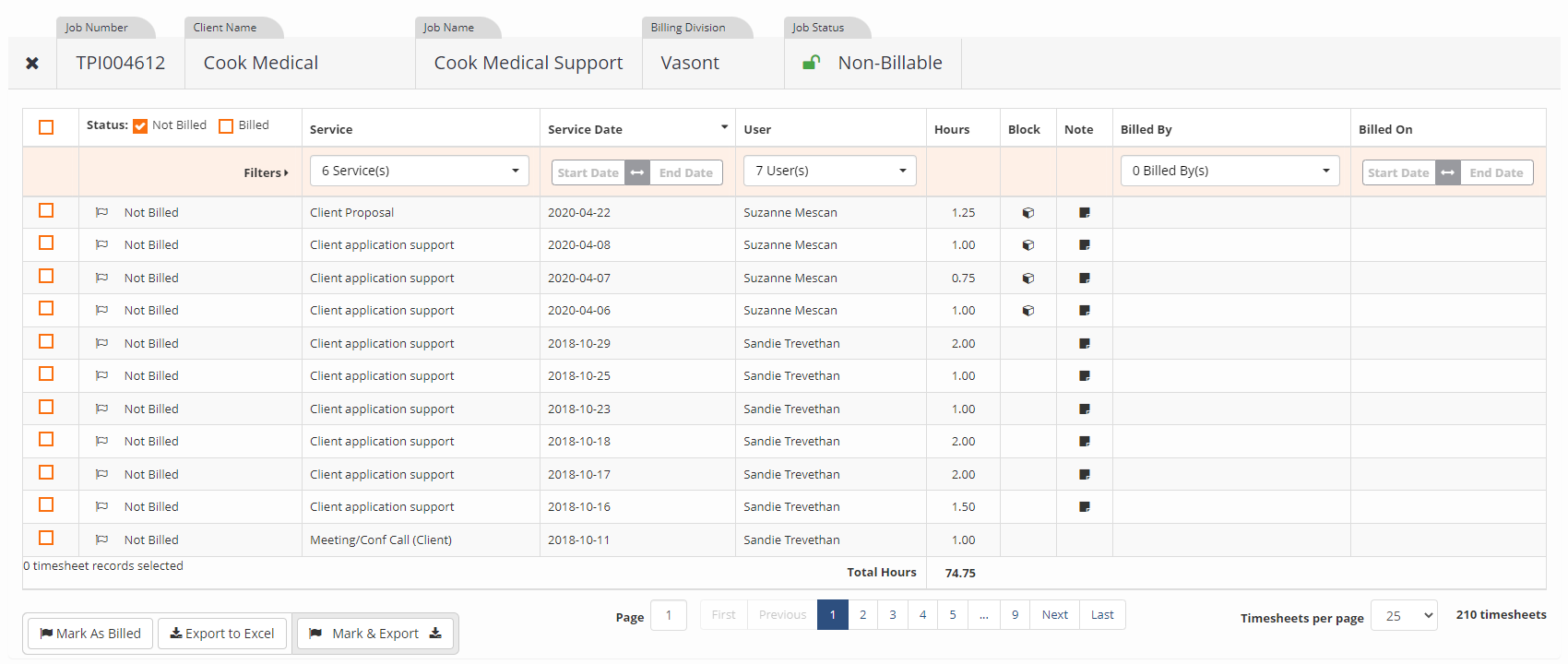
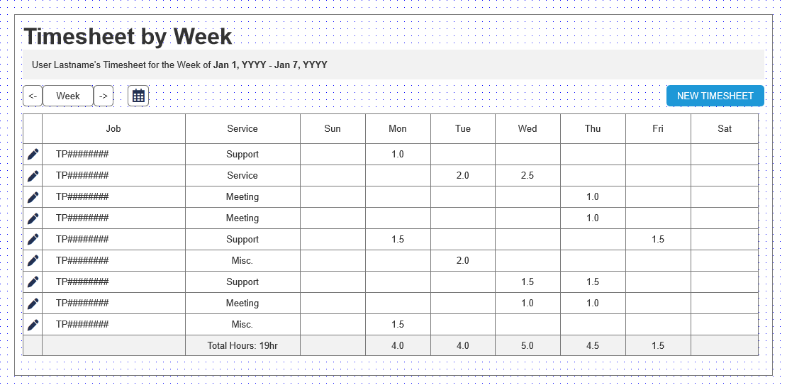
Timesheet Console, Block Manager, Billing Console Sample Screens
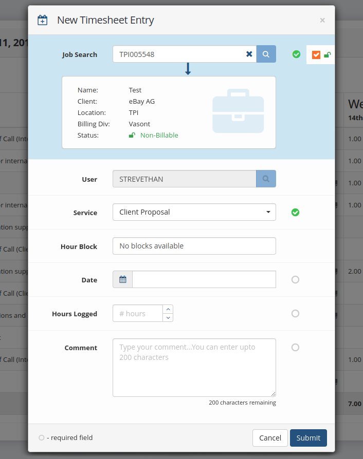
New Timesheet Entry Modal (pop up)
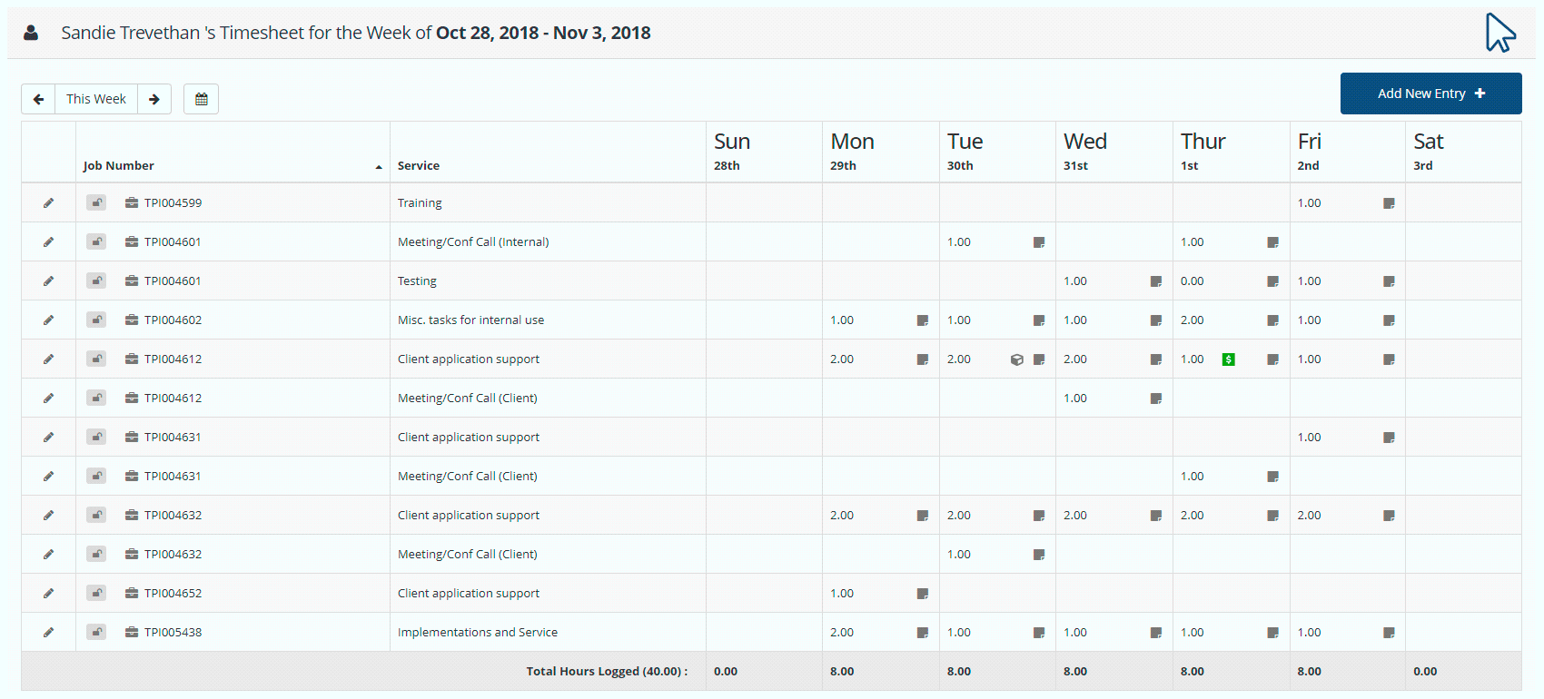
Timesheet Console Demo
 The introduction of UX methodologies (like user flows and wireframes) helped engineers see the bigger picture and reduced the amount of post-development revisions.
By taking on the design and research tasks, it allowed engineers to focus on coding and problem-solving, which improved overall productivity.
The introduction of UX methodologies (like user flows and wireframes) helped engineers see the bigger picture and reduced the amount of post-development revisions.
By taking on the design and research tasks, it allowed engineers to focus on coding and problem-solving, which improved overall productivity.
 Future projects could benefit from more agile collaboration, with design and development teams working in parallel rather than sequentially, to improve efficiency.
Shifting the focus from simply building features to actually solving verified user pain points resulted in a more intuitive app that better aligned with user needs.
User feedback helped create a product that was not just functional but easy to use, particularly for non-technical users like sales and finance teams.
Having more than 1 round of testing could have allowed for a more refined solution, ultimately leading to an even better user experience.
Introducing elements of design thinking into the waterfall structure, such as upfront user research and design prototypes, led to more informed decisions and reduced back-and-forth during development.
Establishing more structured communication, such as regular check-ins and feedback sessions, improved alignment between stakeholders and the engineering team. This helped prevent misunderstandings and ensured that design decisions were well understood and supported by all parties.
Instead of fully disrupting the established waterfall process, incorporating small, design-driven steps (like early-stage prototypes or quick user testing sessions) could have eased the transition. This would have shown the value of iterative feedback while allowing the team to adapt without overwhelming their familiar workflow.
Future projects could benefit from more agile collaboration, with design and development teams working in parallel rather than sequentially, to improve efficiency.
Shifting the focus from simply building features to actually solving verified user pain points resulted in a more intuitive app that better aligned with user needs.
User feedback helped create a product that was not just functional but easy to use, particularly for non-technical users like sales and finance teams.
Having more than 1 round of testing could have allowed for a more refined solution, ultimately leading to an even better user experience.
Introducing elements of design thinking into the waterfall structure, such as upfront user research and design prototypes, led to more informed decisions and reduced back-and-forth during development.
Establishing more structured communication, such as regular check-ins and feedback sessions, improved alignment between stakeholders and the engineering team. This helped prevent misunderstandings and ensured that design decisions were well understood and supported by all parties.
Instead of fully disrupting the established waterfall process, incorporating small, design-driven steps (like early-stage prototypes or quick user testing sessions) could have eased the transition. This would have shown the value of iterative feedback while allowing the team to adapt without overwhelming their familiar workflow.
The redesign of TransPerfect’s timesheet application marked a pivotal shift towards a user-centered, design-driven approach within this group’s legacy development process. By prioritizing UX research and creating reusable components, we not only enhanced the user experience for a complex internal tool but also set a new standard for future projects. Introducing design thinking to the existing workflow led to a more intuitive, efficient application that significantly reduced user pain points and made the development process more streamlined. As the first designer I was able to demonstrate the long-term value of user-centered design and guide this new chapter of design-based development — setting a foundation for future projects.
| Client: | TransPerfect |
| Product Name: | RIPS: Rapid Invoice Processing System |
| My Role: | UX, UI, copywriting, HTML, CSS, testing |
| Product Type: | Public facing web application |
| Project Type: | Complete front-end mobile-first redesign |
| Tools used: | Figma, DevTools Inspector, Photoshop |
TransPerfect is the world’s largest language services provider. They provide language and technology solutions for a global list of companies and complete over 400,000 projects per year. TransPerfect works with over 10,000 translation vendors offers a comprehensive suite of digital tools. For this project the organization sought to modernize its vendor invoice submission platform to meet evolving technological and user experience standards.
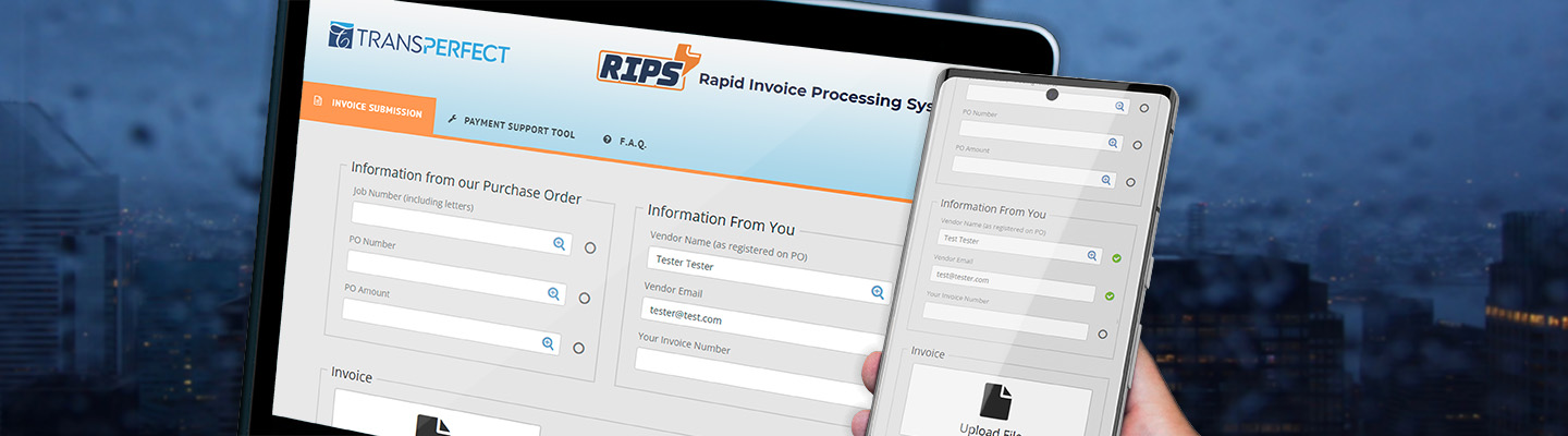
The focus of this project was to redesign the pre-existing RIPS (Rapid Invoice Processing System) website that was used by TransPerfect vendors to submit invoices for work completed as well as a way to get support for outstanding invoices. The original website was noticeably outdated and had no mobile/responsive features at all. The key objectives were to create a more intuitive, accessible, and visually aligned digital platform that would support TransPerfect's vendors more effectively.
As the sole designer tasked with this project I was responsible for the comprehensive redesign of the entire RIPS website. My role encompassed involvement during the entire processes: UX research, UX design, UI design, front-end HTML and CSS framework, and testing at every phase.
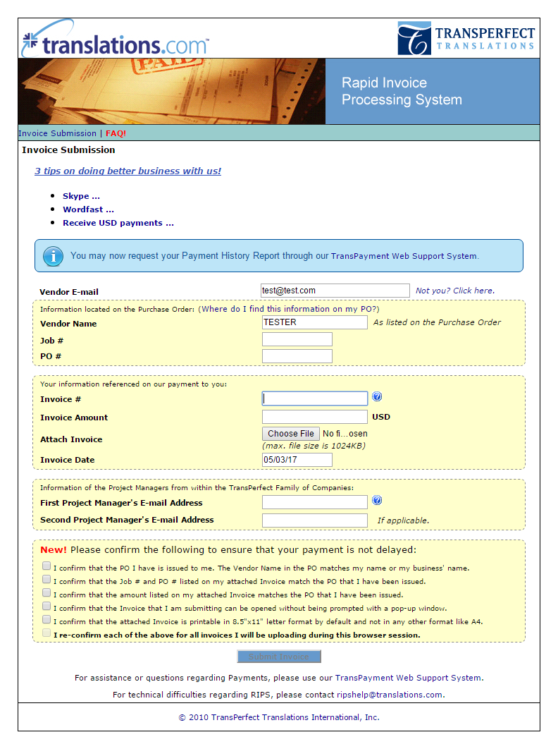
Original TransPerfect RIPS site (Pre-Redesign)
The original website was built before the "mobile era" and was completely non-responsive, creating significant barriers for vendors attempting to submit invoices from smartphones or any devices with smaller screens. This challenge required a comprehensive redesign that could seamlessly translate desktop workflows into an intuitive mobile interface.
Stakeholders of this project placed a high importance on preserving the core functionality that vendors were already familiar with and relied on. The redesign needed to balance innovative design with a conservative approach that minimized learning curves and maintained the platform's fundamental utility.
The legacy website's visual design was severely disconnected from TransPerfect's contemporary corporate identity. The redesign necessitated a systematic update of color schemes, typography, and visual elements to align with current branding standards while improving overall user experience.
I wrote and implemented an in-depth survey targeting translation vendors to gather detailed insights into their needs, preferences, and pain points. The survey results provided critical data that directly informed design decisions and feature prioritization.
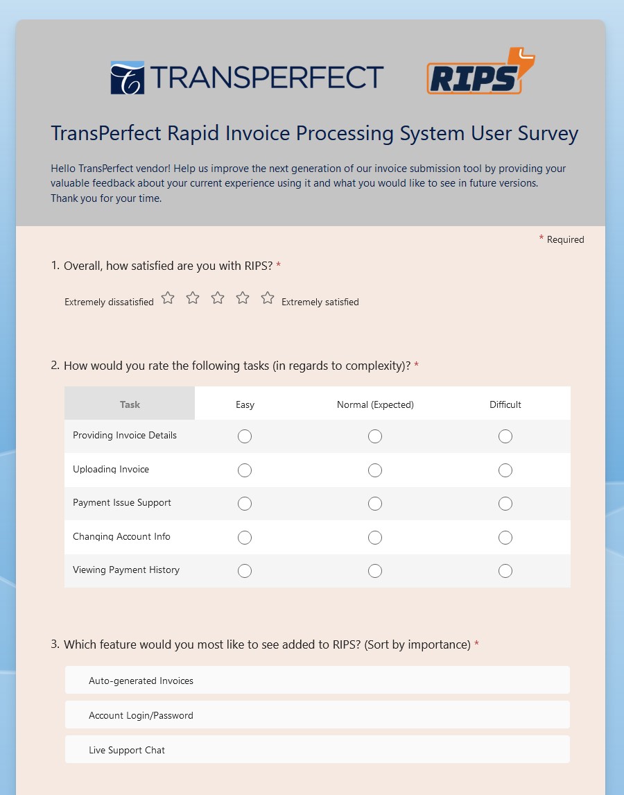
Vendor Survey (screenshot)
To identify best practices and potential areas for innovation I analyzed and audited popular time-tracking web applications for:
A thorough analysis of existing website analytics revealed key usage patterns and critical functional elements. These data-driven insights were instrumental in prioritizing design improvements and understanding how vendors interacted with the existing platform.
Leveraging Bootstrap as a foundational framework, I created a custom design system with a comprehensive component library ensuring design consistency. This approach allowed for a flexible yet structured visual language that could be applied across different sections of the platform.
I created Figma wireframes to map the entire vendor interaction process. These deliverables provided a clear visualization of the user journey from invoice submission to payment confirmation, as well as some of the support-area layout. A mobile prototype was created as well. Check out the Figma wireframes by clicking the link below.
Implementing WCAG standards was a design principle from the early stages of the project, ensuring color contrast, keyboard navigation, and screen reader compatibility.

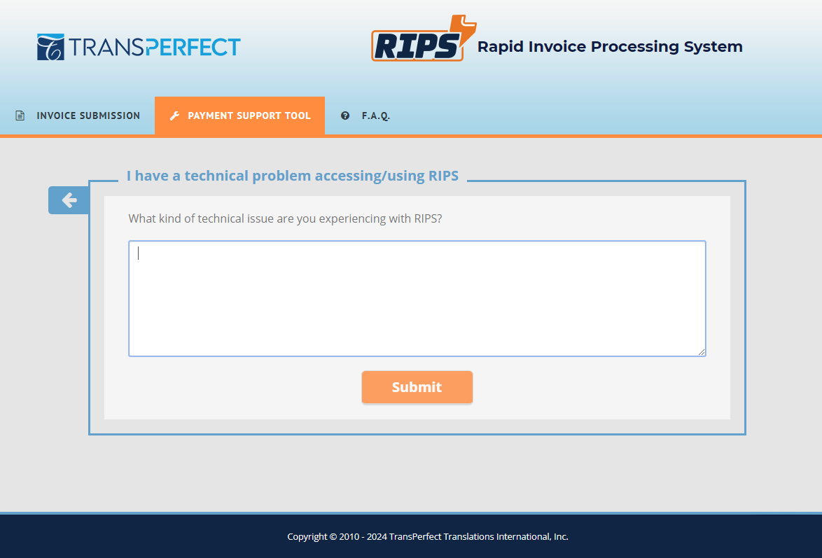
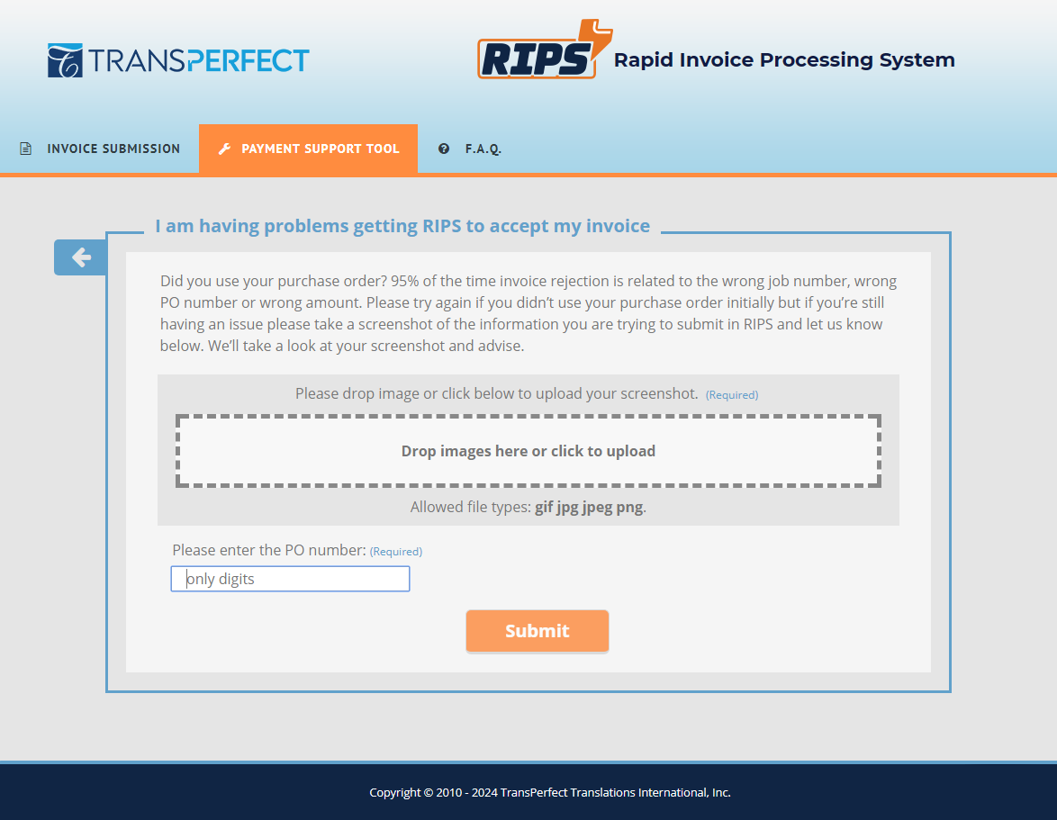
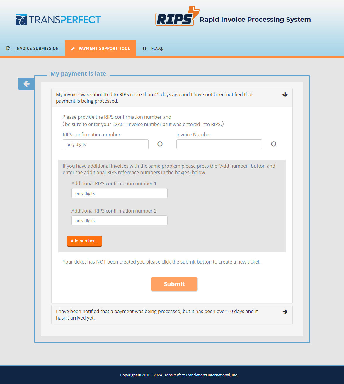
Login and 3 "Payment Support Tool" Sample Screens
I developed systematic test scenarios covering diverse user interactions and personally tested the site across multiple devices and browser configurations. This approach ensured comprehensive evaluation of the platform's functionality and user experience.
The testing phase involved iterative design refinement based on initial test results, with incremental improvements addressing identified usability issues. This approach guaranteed consistent performance across different user scenarios.
A controlled beta test was conducted with a selected user group to gather real-world feedback and validate design choices. This step was crucial in fine-tuning the website's functionality based on a small set of diverse user perspectives.
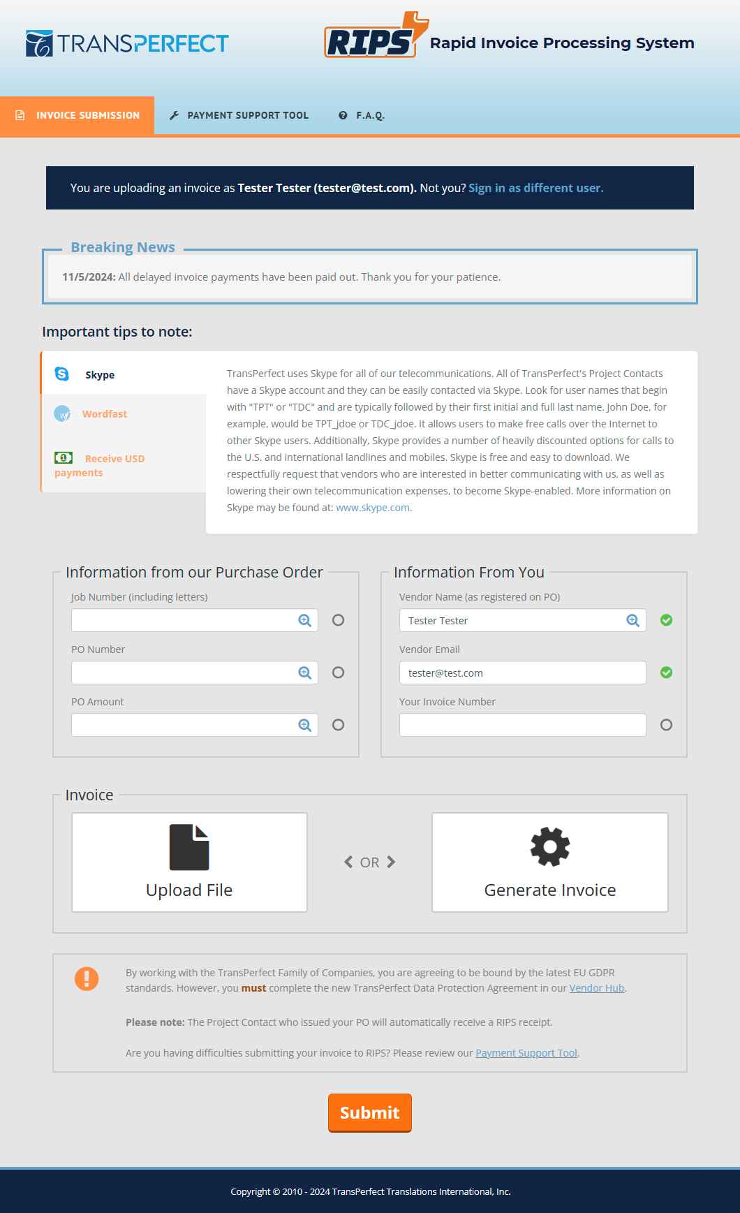
Main RIPS Invoice Submission Page (screenshot)
Post-launch analysis revealed a significant reduction in support staff intervention requests and a substantial increase in mobile device platform usage. These metrics demonstrated the tangible improvements brought on by the redesign.
Post-launch user satisfaction surveys collected qualitative feedback from translation vendors, providing insights into the platform's perceived improvements. The results indicated a positive reception of the new interface.
The redesign led to increased adoption of new self-service features and a more streamlined invoice submission process. This positioned TransPerfect to gain a competitive advantage by having another tool in its modernized, user-centric digital platform.
The implementation of a Bootstrap-based design system significantly accelerated development time and provided immediate responsive capabilities across all viewports. The predefined component library ensured consistency throughout the platform and simplified handoff to developers.
There were some limitations in creating highly customized components — which occasionally required complex CSS overrides.
Taking a mobile-first approach helped prioritize essential features and streamline user flows, resulting in a more focused experience across all devices. This strategy led to improved performance metrics and higher mobile adoption rates among vendors.
When expanding to desktop view it was sometimes a struggle to fully utilize the additional screen real estate without compromising the simplified mobile-first architecture.
Maintaining a familiar workflow proved to be invaluable for user adoption and reduced training needs for existing vendors. The careful balance of old and new resulted in minimal support tickets and positive feedback from long-term users.
This conservative approach occasionally limited the ability to implement more innovative solutions that could have potentially improved efficiency further.
This redesign project demonstrated the vital importance of balancing innovation with user familiarity when modernizing critical business tools. By prioritizing mobile responsiveness (while maintaining core functionality), we successfully transformed an outdated platform into a modern, efficient system that serves TransPerfect's global network of vendors. The project's success was rooted in thorough research, strategic design decisions, and careful attention to user needs throughout the development process. While certain constraints presented challenges, they ultimately led to creative solutions that enhanced the platform's usability without disrupting essential workflows. The resulting system not only meets current technological standards but also provides a foundation for future improvements and innovations in TransPerfect's digital ecosystem.

Link: simedesign.net/google-careers
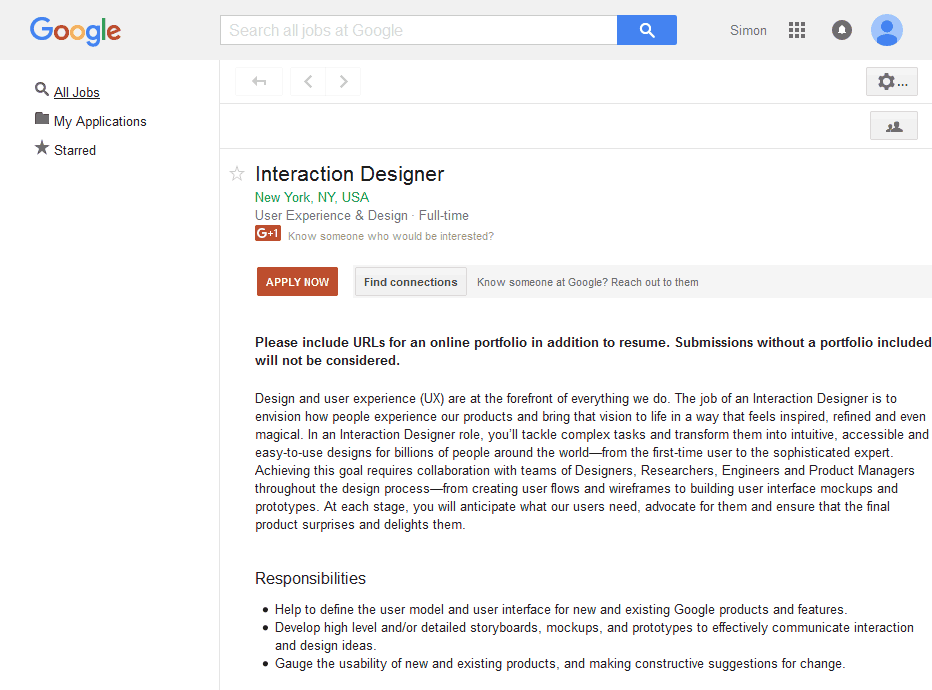
Google, like many large companies, maintains an entire site dedicated to helping people learn about the company and finding employment there. The purpose of this type of site is twofold: 1. Help potential jobseekers find a career they are interested in, 2. Promote the brand and culture through a memorable experience with engaging content.
It was my hypothesis that the current (2015) iteration of the Google Careers site is not accomplishing the aforementioned core objectives because of two key factors: 1. The site is not inherently designed to deliver an ideal mobile-friendly/responsive experience, 2. The dated and inconsistent appearance does not promote the brand as well as it could–given Google’s pioneering initiatives in the area of interaction design (through its Material Design language).
On April 20, 2016 Google updated their Careers site! The case study that follows here was completed before ever seeing the new/current Google Careers site. It is interesting to see the direction they took the new site in regards to UX and aesthetics.
The visual design is a unique take on the Material Design methodologies we have come to expect from Google. The features added mirror many of the decisions I made when constructing my updated version including: “Material Design” design language, responsive layout, expanded search sorting/filters, unrestricted sharing, artwork based role header/hero image (not unique by location-yet), and colorful action buttons.
Overall it is a welcomed upgrade that I think will accomplish the same goals I envisioned my own redesign would: a better experience and a more positive opinion of the brand for the user.
See it for yourself here.
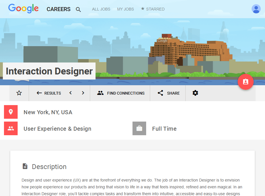
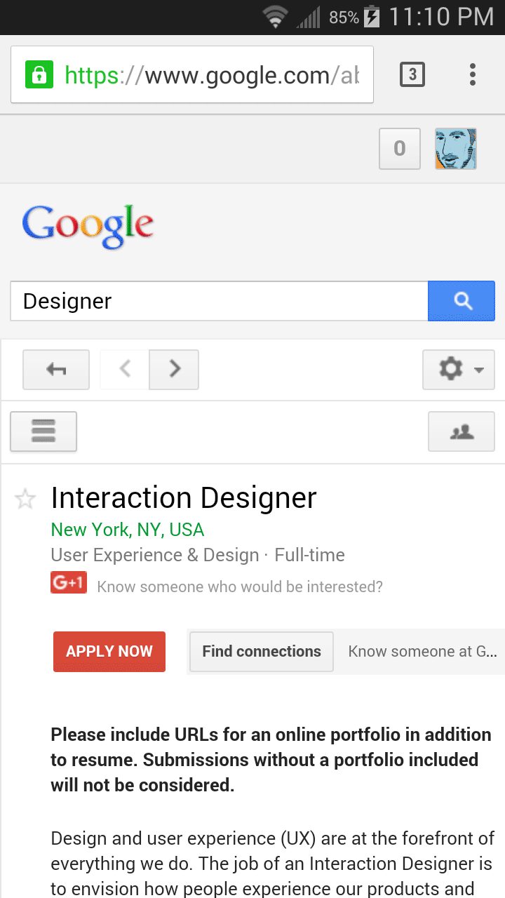
Screenshot of Google Careers website (2015)
To see if I was right, and to further my exploration of the redesign project, I would need to poll an unrestricted demographic about their thoughts on the current site (good and bad), general feelings towards career sites, and get baseline technical/demographic data points (collected at the end to prevent “stereotype threat”). I built a survey using Google Forms and used Amazon Turk to recruit people to participate.
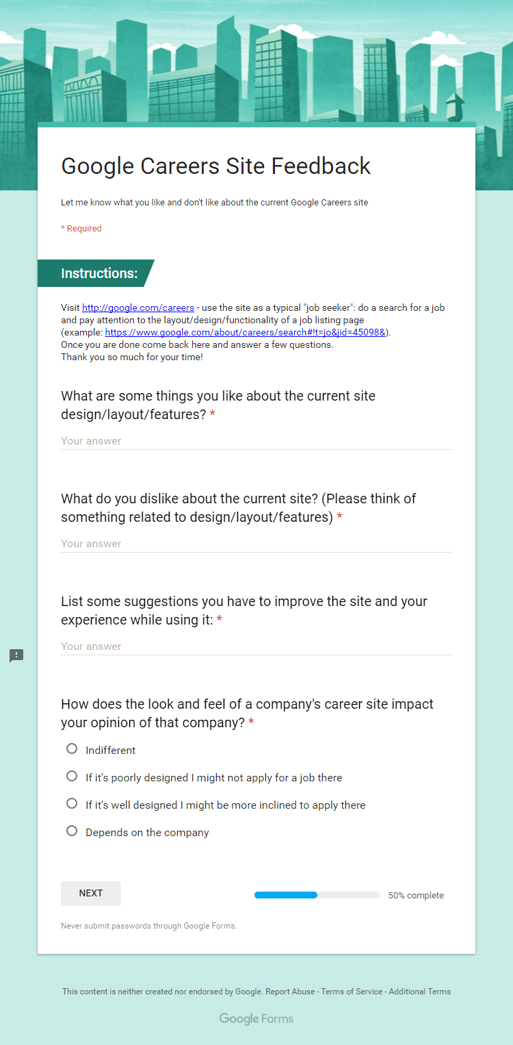
The purpose of my qualitative survey questions was to give users an open-ended way to respond freely about any concerns, likes, and first impressions they had while using the careers site.

The purpose of my quantitative questions was to force users to consider the importance a career site has in the impression they get of a company, as well as to collect general demographic data for analyzing during throughout this project.
To further determine which features should be present on a career site from a company like Google I did a competitive analysis using the career sites of 12 similar companies to help me decide where candidates might also be looking for a job.
| Career Site Features | Airbnb | Amazon | Microsoft | Yahoo! | Apple | Salesforce | IBM | HP | Oracle | |||
|---|---|---|---|---|---|---|---|---|---|---|---|---|
| Custom Site | ||||||||||||
| Responsive | ||||||||||||
| Search | ||||||||||||
| Persistent Search | ||||||||||||
| Browse by Location | ||||||||||||
| Browse by Team | ||||||||||||
| Location Photo | ||||||||||||
| Location Art | ||||||||||||
| Employee Articles | ||||||||||||
| Employee Videos | ||||||||||||
| Share Role | ||||||||||||
| Related Roles |
Key: Present; Missing; Partial
I used data collected from my own survey as well as some prominent national surveys and reports to build three common personas to aid in the next steps of the redesign process.
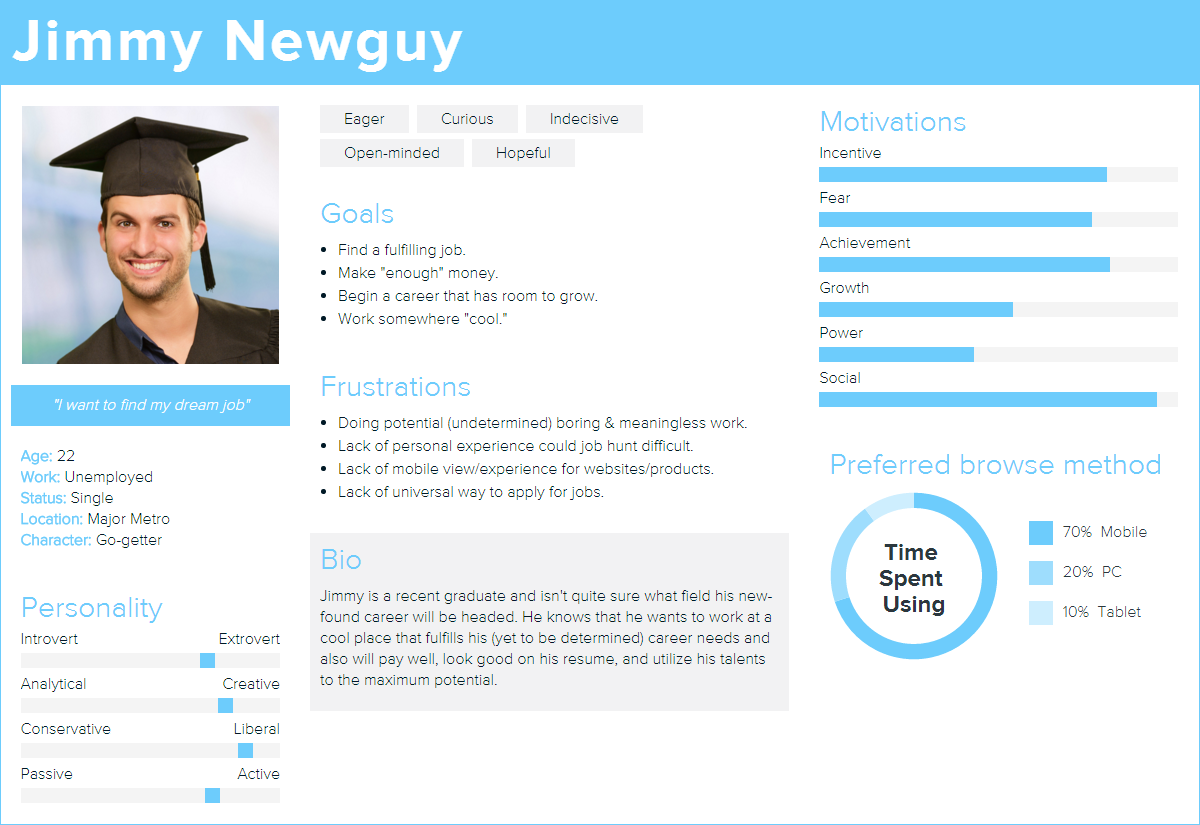
Persona - Jimmy: entry level jobseeker
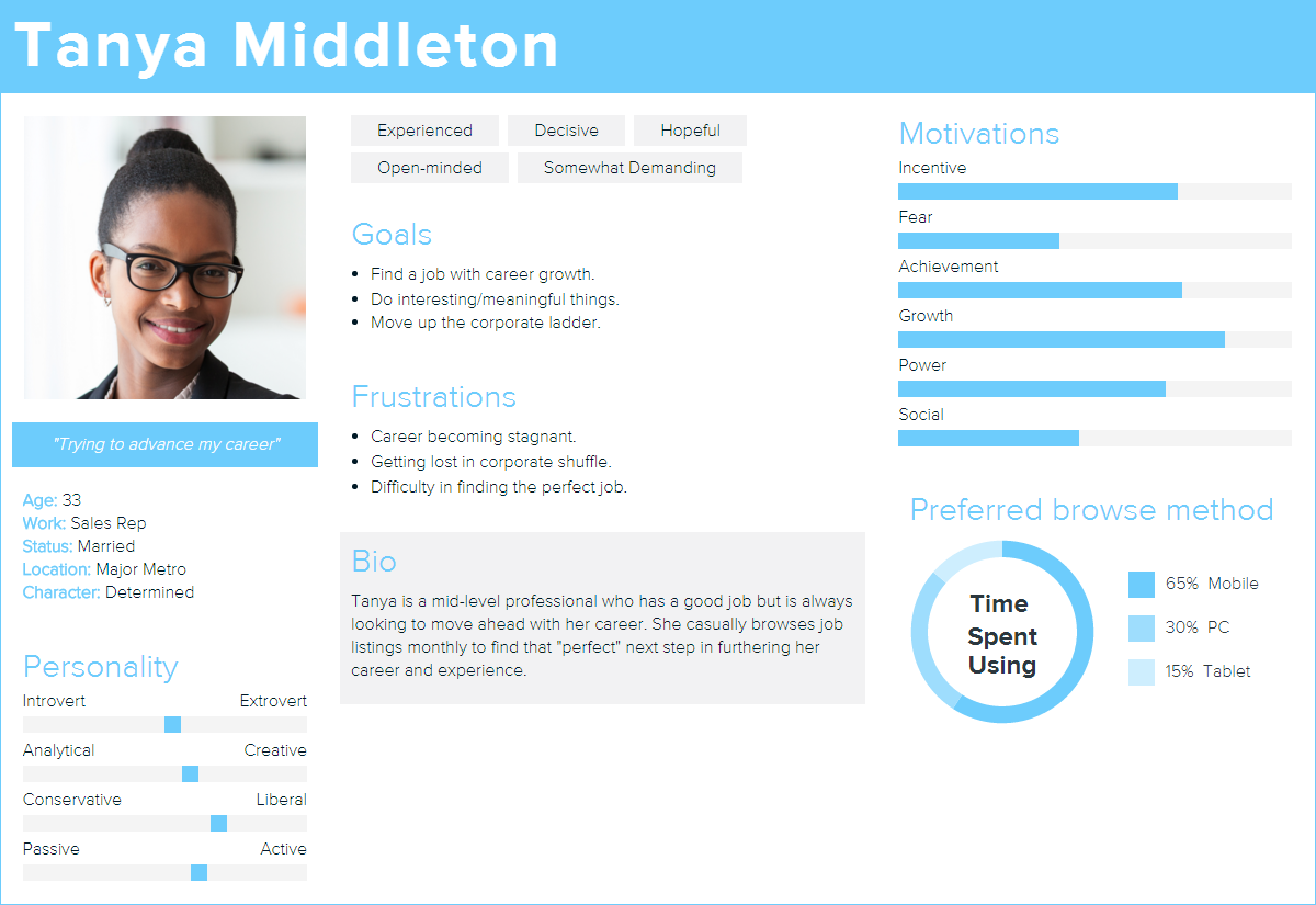
Persona - Tanya: mid-level jobseeker
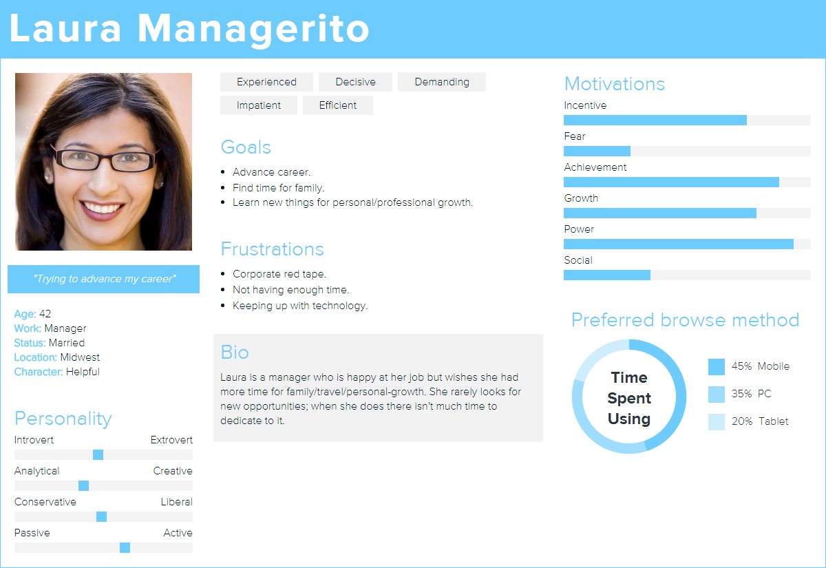
Persona - Laura: manager-level jobseeker
To evaluate what users would be expecting and interacting with while on the career site I built 2 user journey flowcharts. These represent two of the most common goals jobseekers have (searching and learning) and include all the features and actions they require to have the most fulfilling experience while using the career site.
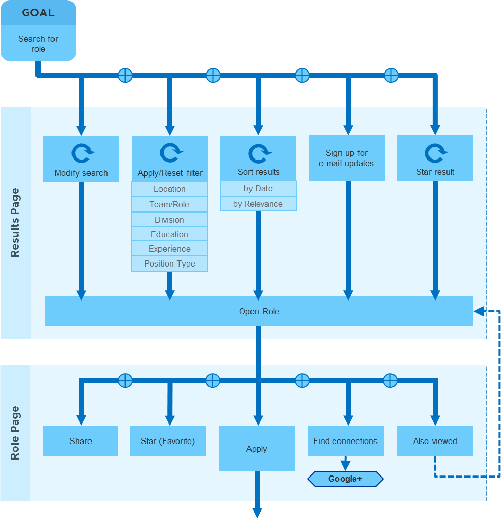
User Journey - Goal: Search for Role
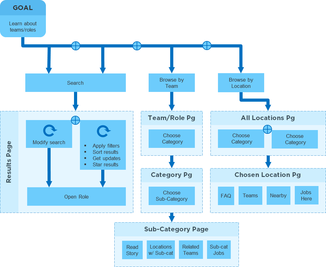
User Journey - Goal: Learn about Teams/Roles
These low fidelity artifacts take everything I learned from my research and present it in an actionable and easily digestible way. I was able to rapidly prototype and iterate using Axure RP to build these wireframes. The four designs below feature the two most important and complex pages that users will encounter during their time interacting with the site using search.
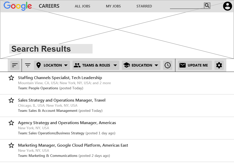
Wireframe: Search Results Page
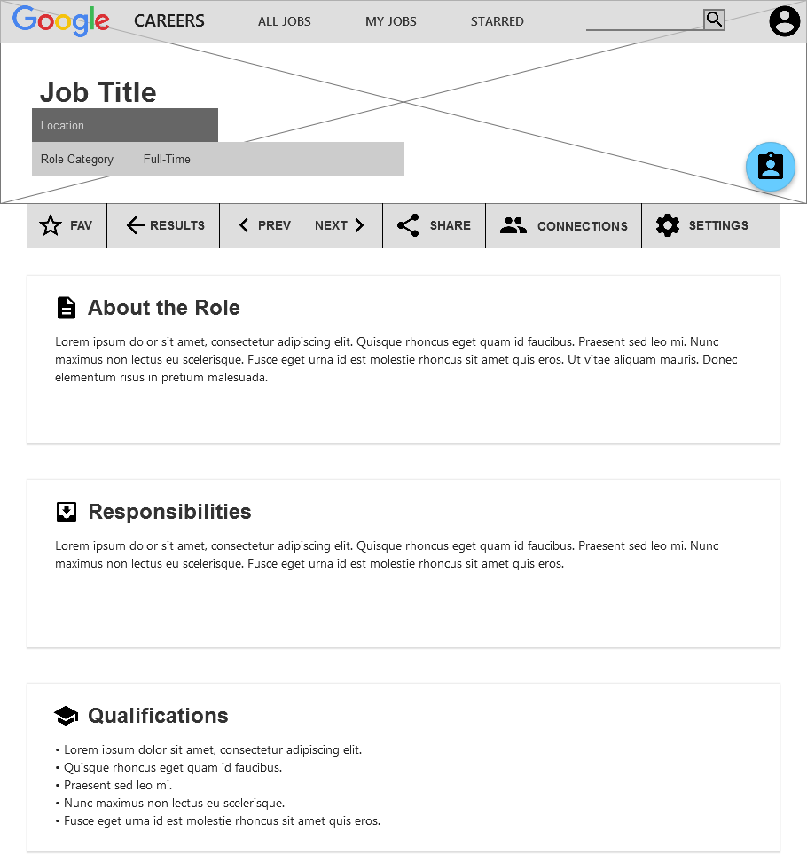
Wireframe: Role Page
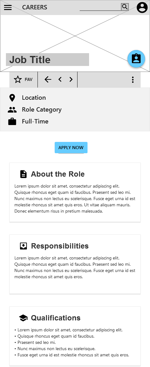
Wireframe: Role Page (Mobile View)
Wireframe: Role Page with Drawer Open (Mobile View)
Google’s Material Design system is rooted in all of Google’s core products and websites. The minimalist and mobile-first philosophy is what defines Google as a leader in interaction design and forward-thinking methodologies. I wanted the design to fit seamlessly into Google’s corporate branding identity while maintaining all the current functionality and content; as well as adding new desired features.
I also added something unique to help the site stand out from the rest of the corporate career sites: a location based header image done in a Google Now/Brent Couchman style which I created myself using reference photos of the Google HQ in NYC.
New Google Careers UI
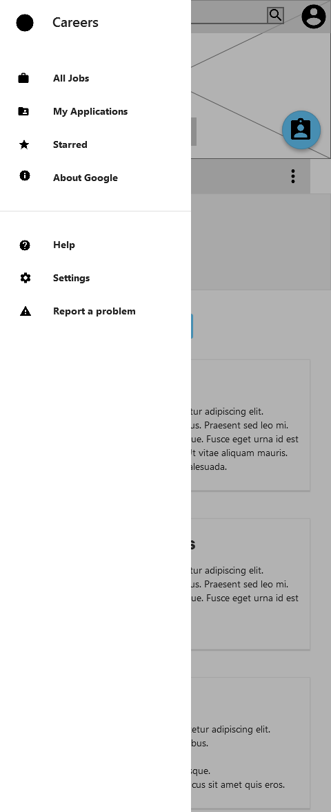
My design is completely responsive and utilizes Google's Material Design drawer to contain most of the main navigation items for narrow screens. The secondary interface items (favorite, back to results, previous listing, next listing, share, etc) are efficiently presented in one horizontal space-saving bar.
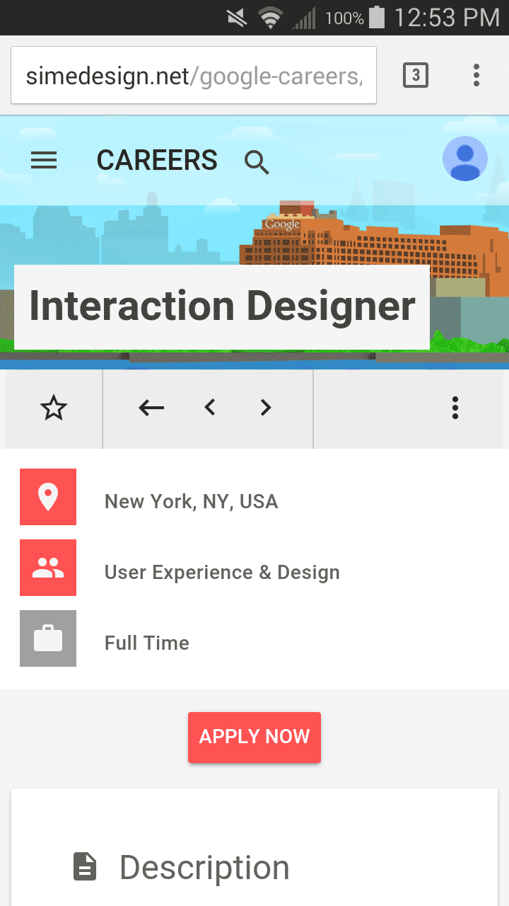
Mobile / responsive view
Original (2015) mobile / responsive view
I built an interactive and functional (responsive, clickable buttons, etc) prototype using Google’s Material Design Lite library to get an impression of how the site looks and functions on a variety of devices. Click the link below to check it out; thank you for reading my case study.